- How did the grid influence the way you organized information?
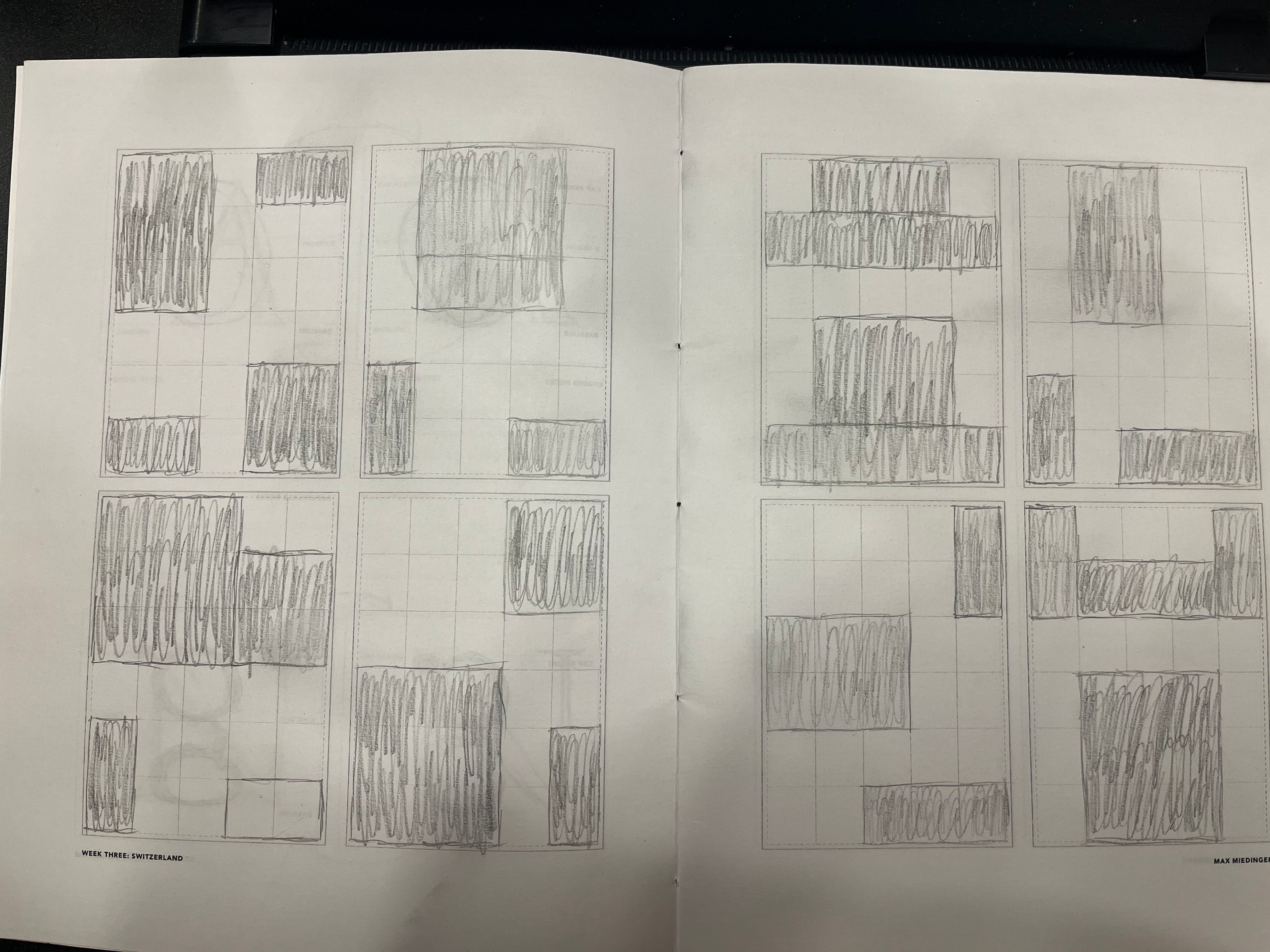
The influence from the grid gave me an idea of where I can draw the boxes when it comes to planning where to put the text or images for a poster and cover art. - Which layout felt the clearest or most balanced, and why?
I’d say the 5th box and the 8th are the closest to being the most balanced. - How did spacing and alignment help communicate hierarchy without using words?
Yes, it did, even for all 8 boxes - How does Müller-Brockmann’s idea of objective design change how you think about layout?
It did and gave me much to to think and place the text and images if I were to make cover art or a poster

Leave a comment