- What specific issues made the original typography hard to read?
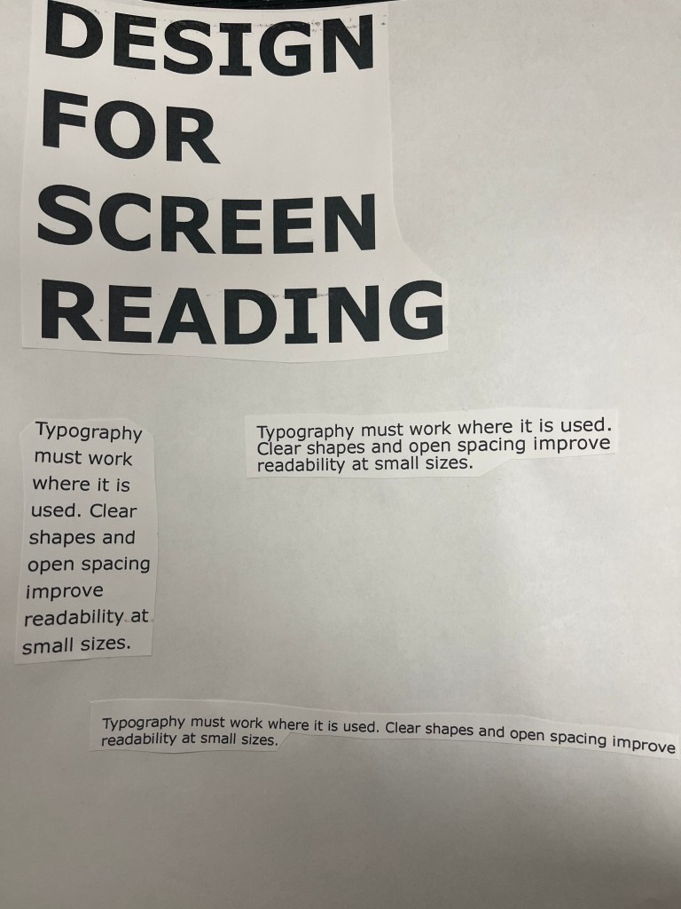
Most of the text seemed a bit cluttered, some spots are close to other pieces of text. - What changes did you make to improve legibility?
I cut the text out and figured out where to place them at firs,t and then I would glue the pieces together on th.eir destinated spots - How did spacing, line breaks, or hierarchy affect readability?
Some pieces of text look fine the way they are, and others could also be placed or moved a bit. - How does this activity connect to the idea that typography should solve problems?

Leave a comment