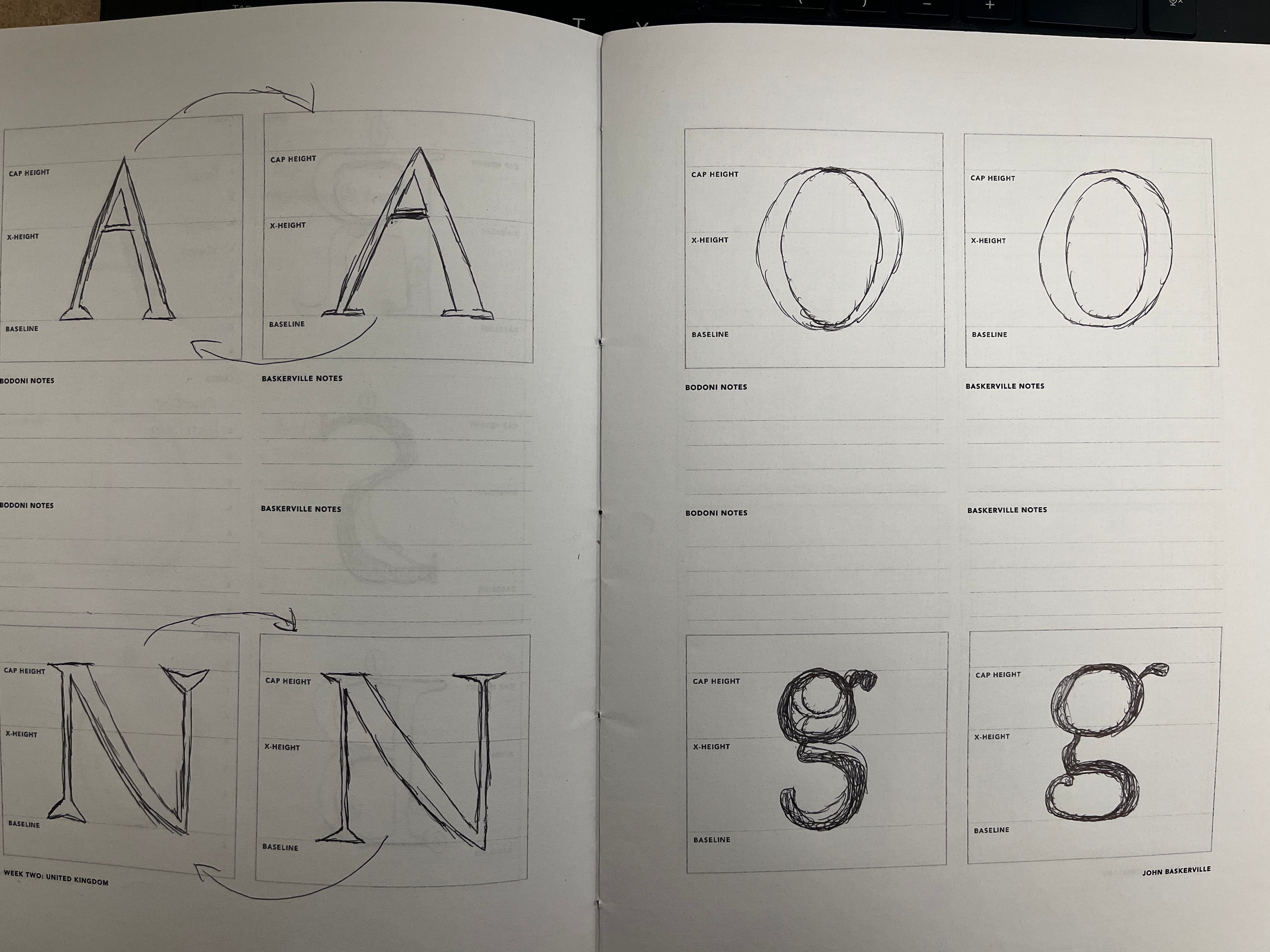
- What structural differences did you notice between Baskerville and Bodoni as you drew the same letters?
I noticed that for the capital letters in the Baskerville font, certain areas are a bit thicker than those in Bodoni’s font for A, N, O, and g. - How do changes in contrast, serif shape, and stress affect readability between the two typefaces?
I would thin out and in increase the stress affect a bit, change the serif shape a bit to slightly bend or straight, and I would increase the contrast on one font. - Which typeface feels more comfortable to read, and in what situations might each be most appropriate?
I would honestly say Baskerville is a bit more comfortable and easy to read when you want to type something out. - How did drawing the letters by hand change the way you noticed these differences?

Leave a comment